Why Your Website Looks Good and Still Doesn't Convert
Traffic arrives and nobody acts. Six reasons a well-designed site fails, ordered by how much each one costs you.
In short
A site converts when a stranger can answer three questions in about five seconds: what is this, is it for me, and what do I do next. Beautiful sites fail when they answer the first and skip the other two.
3 questions, 5 seconds
What is this, is it for me, and what do I do next. Miss any one and the visitor leaves
The usual causes, in the order they cost you the most: no clear next step, a headline about the company instead of the customer, proof buried below the fold, forms asking for more than the moment deserves, slow loading on mobile, and traffic that was never going to buy.
Design quality and conversion are different problems
This is the part that stings. A site can be genuinely well designed and still convert badly, because design solves for impression and conversion solves for decision.
Impression is whether someone believes you are credible. Decision is whether they know what to do and feel safe doing it. A gorgeous site with no obvious next step has done the first job and abandoned the second.
Which is why "redesign the site" is so often the wrong prescription. If the underlying problem is that nobody knows what happens after they click, a new visual direction changes nothing except the invoice.
Six reasons, most expensive first
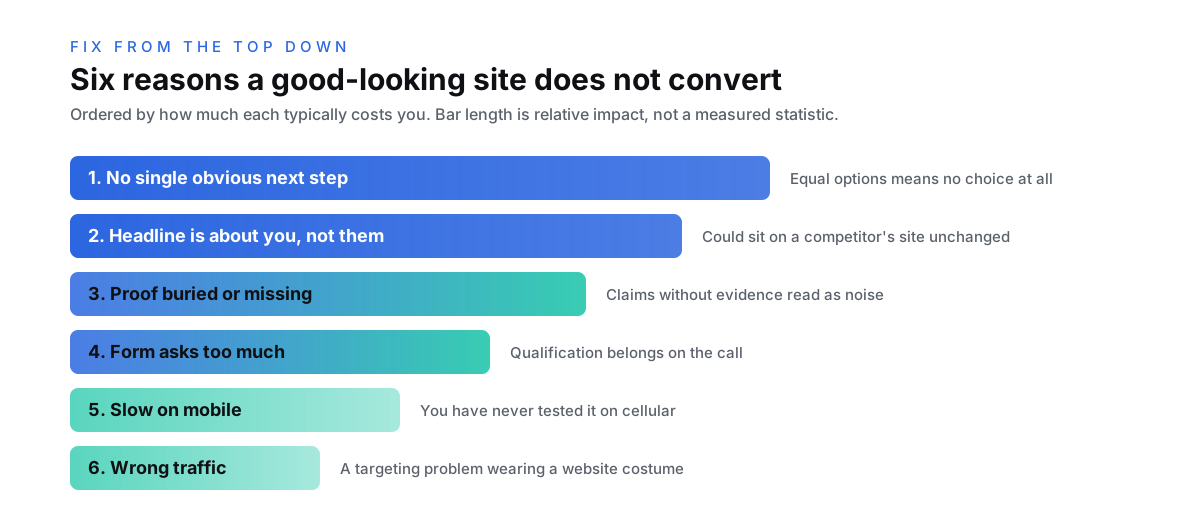
1. There is no single obvious next step. Most underperforming pages offer three or four equally weighted actions. Book a call, download the guide, browse services, join the newsletter. Faced with equal options, people choose none. Every page should have one primary action, repeated at natural decision points, with everything else visibly secondary.
2. The headline is about you. "Your partner in digital growth" tells a visitor nothing they can act on. A headline earns its place by naming what changes for the reader. If your headline could sit on a competitor's site unchanged, it is not doing work.
3. Proof is below the fold, or absent. Claims without evidence read as marketing noise. Numbers, named clients, and real outcomes placed immediately after the claim they support do more than any amount of visual polish. Unattributed praise does nothing at all.
4. The form asks for too much, too early. Every additional field costs completions. A first contact needs a name, an email, and a sentence about the project. Phone number, company size, budget range and timeline are qualification questions, and qualification belongs on the call, not the gate.
5. It is slow on a phone, and you have never seen it that way. You test on a fast laptop on office wifi. A meaningful share of your visitors are on mobile on a mediocre connection. If the page takes several seconds before anything useful appears, a portion of them leave before your design has rendered at all.
6. The traffic was never going to convert. If you rank for informational terms with no buying intent, a rising traffic line and a flat lead line are exactly what you should expect. This one masquerades as a website problem and is actually a targeting problem. It is also the slowest to fix, because content and rankings move on SEO timelines, not design timelines.
How to work out which one is yours
You do not need expensive tooling to diagnose this.
Read your own homepage as a stranger. Better, ask someone outside your industry to read it for five seconds, then close it and tell you what you do and who for. If they cannot, the problem is upstream of design.
Look at where people leave. Analytics will tell you whether they bounce from the homepage, browse and never reach contact, or reach the form and abandon it. Those are three different failures with three different fixes, and the fix for one does nothing for the others.
Watch it load on your own phone, on cellular data, not wifi. Most conversion problems that people blame on design are visible in the first three seconds of that test.
If a visitor cannot say what you do, who it is for, and what happens next, the site has not failed at design. It has failed at being understood, and those are fixed in different places.
Fix in this order
Start with the cheapest changes that touch the most people.
Headline and primary action first, because they affect every visitor and cost nothing but judgment. Then proof placement, moving your strongest evidence directly beneath the claim it supports. Then form length, cutting every field that is not needed to start a conversation. Then performance on mobile. Only then consider whether the visual design is genuinely the constraint.
Most sites gain more from the first two than from a full redesign, which is an uncomfortable thing for an agency to write down and true anyway. When a rebuild genuinely is the answer, our website design work starts from these fundamentals rather than bolting them on afterwards.
What counts as proof
Proof is the fix most sites get half right, so it is worth being precise about what qualifies.
A number with a name attached outranks everything else: a result, a retention rate, a growth figure a real client would stand behind. Next come attributed reviews, with a full name and the platform they were written on, because anyone can go and check them. Client logos work as a wall, not a scattering; quantity is the signal there. Anonymous praise, stock photos of smiling teams, and awards nobody recognizes sit at the bottom, and the last two can actively cost you credibility with a buyer who has seen them on a thousand other sites.
Placement does the rest of the work. Proof persuades when it sits directly beneath the claim it supports. A testimonials page nobody visits is a filing cabinet, not an argument.
When it really is the design
Everything above says design is rarely the first problem. Sometimes it genuinely is, and the tells are worth knowing.
Design is the constraint when the site actively undermines trust: it renders badly on the phones half your visitors use, it looks abandoned next to every competitor a buyer compares you against, or it presents a premium service with a bargain-bin face. Impression is a real part of conversion, and when the impression contradicts the price point, clarity alone cannot close the gap.
The distinction to keep is this. If visitors misunderstand you, fix the message. If they understand you and doubt you, fix the presentation. And if the doubt runs deeper than the website, into what the company means rather than how it looks, that is a brand question, and rebrand or refresh covers how to tell which side of it you are on.
What good looks like
Conversion rates vary enormously by industry, traffic source, and what counts as a conversion, so treat published benchmarks with suspicion. The more useful measure is your own trend against your own baseline after each change, one change at a time, so you know which one moved it.
What is consistent across every site that converts well: a single clear promise, one obvious action, proof next to every claim, and nothing between the visitor and the next step that does not need to be there.
Frequently asked questions
Why is my website not converting? Most often because there is no single obvious next step, or the headline describes the company rather than what changes for the customer. Both are fixable without redesigning anything, and both affect every visitor.
Does website design affect conversion rate? Design affects whether someone believes you are credible, which is necessary but not sufficient. Conversion also needs clarity about what to do next and proof that it is safe to do it, which is why a beautiful site with no clear action still fails.
How can I improve my website conversion rate? Fix the headline and primary call to action first, since they touch every visitor and cost nothing. Then move your strongest proof directly beneath the claims it supports, shorten forms to the minimum needed to start a conversation, and check load speed on a phone using cellular data.
How many calls to action should a page have? One primary action, repeated at natural decision points down the page, with any secondary options styled so they clearly rank below it. Multiple equally weighted actions reliably reduce completions because they push the decision back to the visitor.
Should I redesign my website if it is not converting? Usually not first. Redesign is the most expensive intervention and often addresses impression rather than decision. Work through message, action, proof, form length, and speed before concluding the visual design is the constraint.
How long before conversion changes show results? You can see directional movement within a few weeks on a site with reasonable traffic, but you need enough visitors for the difference to mean anything. Change one thing at a time, or you will know the number moved without knowing why.

Written by
Nick Kvistad
Principal Strategist
Put this to work
Reading about it is free. So is finding out what it would take for your business.
Tell us what you are building and we will tell you honestly what it needs, whether or not you hire us. 85% of our business comes from referrals, because the advice is worth passing on.