What You Actually Get in a Brand Identity System (Beyond the Logo)
A logo is one asset. A system is the rules that make every asset after it look like they came from the same company.
In short
A logo is a single asset. A brand identity system is the set of rules that decides how every asset you make afterwards looks, sounds, and holds together.
The practical difference shows up six months later. With a logo, every new flyer, deck, and landing page is a fresh set of decisions, and each one drifts slightly. With a system, those decisions are already made, so the work compounds instead of scattering.
Most disappointment with branding traces back to this gap. The client bought a logo and expected the results of a system.
What a system contains
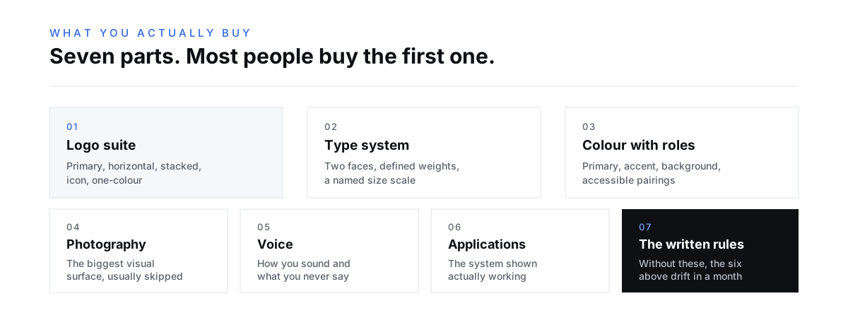
A complete identity system covers seven things. Anything less and you will be improvising within a month.
The logo suite, not a logo. A primary mark, a horizontal version, a stacked version, an icon or monogram for small spaces, and a one-color version for embroidery, etching, and anywhere printing is limited. One file is not enough for the number of shapes a real business needs to fit into.
A type system. Two typefaces at most, with defined weights and sizes for headings, body, captions, and interface text. The scale matters more than the fonts. Named sizes stop every new page inventing its own hierarchy.
A color system with roles, not swatches. Not "here are six colors" but which color is primary, which is for accents, which is for backgrounds, and what the accessible pairings are. A palette without contrast rules produces text nobody can read.
Photography and image direction. What your photos look like: real or styled, warm or cool, people or product, tight or wide. This is the most-skipped piece and the one that does the most damage when missing, because photography occupies more visual space than the logo ever will.
Voice and messaging. How you sound, the words you use for your own offerings, what you never say. A visual system with no verbal system produces beautiful pages that read like a different company wrote them.
Application examples. The system shown working: business card, signage, social post, email header, deck slide, website section. Rules are abstract until you see them applied.
The rules themselves, written down, in a file someone else can follow without asking you.
Why the logo gets all the attention
The logo is the easiest part to judge, so it absorbs the conversation.
Everyone in the room has an opinion about a mark. Almost nobody has an opinion about a type scale, even though the type scale will affect far more of what customers actually see. So review meetings spend an hour on the logo and four minutes on the system that governs everything else.
This is worth resisting. In a normal week your customers might see your logo a handful of times. They will read your type, sit inside your color, and look at your photography constantly.
Judge an identity by what it makes possible, not by how the mark looks in isolation. The question is not "do I like it" but "could someone build next year's website from this without calling me".
The test for whether you have a system
Hand everything you received to a designer who has never met you, and ask them to make something new.
If they can produce a landing page, a one-page sell sheet, and three social posts that look unmistakably like your brand without asking a single question, you have a system. If they have to ask what the secondary color is for, or which font size a subheading uses, or whether photography should have people in it, you have a logo and a color swatch.
That test is worth running before you sign off. It is much cheaper to find the gaps while the project is open.
7 components
What a complete identity system covers. Buying only the first one is the most common reason branding fails to pay for itself
What you should receive at handover
Ask for these explicitly, because scope varies enormously and the difference is rarely visible in a proposal.
Source files in an editable format, not only exports. Fonts, with the license transferred to you or clear instructions on buying it. Every logo variant in vector and raster, in color and in one color. A written guidelines document. And crucially, permission to use all of it however you like, in writing.
That last one catches people out. Confirm you own what you paid for and can hand it to any agency later. An identity you cannot take with you is a rental.
Where systems fall apart
Systems do not usually fail at handover. They fail about four months later, and always the same way: someone needs something urgently, the guidelines are in a file nobody can find, and they improvise. Then the next person copies the improvisation.
The fix is unglamorous. Keep the guidelines somewhere people actually work, keep editable templates for the five things you make most often, and give one person the final say on brand questions. Most drift is not disagreement, it is people guessing because asking felt slower.
If you are weighing up whether your current identity needs replacing or just tightening, rebrand or refresh covers how to tell the difference, and what branding actually costs sets out what each level of scope tends to involve. You can see finished systems in our brand work, or read more about how we approach branding and identity.
Who the system is actually for
Not you. This is the part that reframes the whole purchase.
You already know what your brand should feel like. You do not need a document to tell you. The system exists for everyone who does not have your instincts: the freelancer building next month's landing page, the printer setting up your signage, the new hire making their first deck, the ad platform that needs assets in nine sizes by Thursday.
Every one of those people will make a decision about your brand. The only question is whether they make it by reading your rules or by guessing from whatever file they were sent. A system is how you scale your own judgment to people who have never met you.
This is also why "we know what our brand looks like" is not a substitute. Knowledge that lives in one person's head is a bottleneck at best and a single point of failure at worst.
The parts that survive contact with reality
Some components hold up under pressure and some quietly collapse. It is worth knowing which is which before you decide where to spend.
Logo rules survive. They are concrete, easy to check, and violations are obvious.
Type and color rules survive if they are named. "Heading Large" and "Accent Blue" get used. "28px semibold" and "the second blue" get approximated, then drift.
Photography direction collapses fastest, because the moment someone needs an image urgently they will use whatever is available. The fix is not stricter rules, it is a stocked library. A system that says "warm, candid, natural light" and provides nothing is describing a problem rather than solving it.
Voice guidelines collapse unless they include examples of what not to say. Abstract adjectives like "confident" and "approachable" are unusable. Two columns showing a weak line beside its rewritten version are immediately usable.
What to do next
Before commissioning anything, write down the ten things you produce most often. Business cards probably are not on that list. Proposals, social posts, and landing pages probably are.
Then make sure the system you are buying covers those ten specifically. An identity built around a logo presentation will look magnificent and leave you improvising on everything you actually make.
Frequently asked questions
What is the difference between a logo and a brand identity? A logo is one asset: the mark that identifies you. A brand identity is the complete system around it, including type, color, photography direction, voice, and the written rules for applying them consistently.
What should be included in brand guidelines? Complete guidelines cover the logo suite and its clear-space and minimum-size rules, the type scale, the color palette with roles and accessible pairings, photography direction, voice and messaging, and worked application examples.
Do I own my brand identity files? You should, but confirm it in writing before the project ends. Ask for editable source files, transferred or clearly documented font licenses, and explicit permission to use and modify everything without further approval.
How long does a brand identity system take to build? Most complete systems take six to twelve weeks depending on scope and how quickly decisions get made. The design is rarely the slow part; agreeing the positioning underneath it usually is.
Can I start with just a logo and add the system later? You can, and it costs more overall. Retrofitting a system to a mark that was designed without one usually means revisiting the mark, so you pay for parts of the work twice.
How do I stop the identity drifting once we start using it? Keep the guidelines where people work rather than in a folder, build editable templates for your five most frequent assets, and give one person final say on brand questions. Most drift comes from guessing, not disagreement.

Written by
Nick Kvistad
Principal Strategist
Put this to work
Reading about it is free. So is finding out what it would take for your business.
Tell us what you are building and we will tell you honestly what it needs, whether or not you hire us. 85% of our business comes from referrals, because the advice is worth passing on.